Ami pORTUGUESE hEADQUARTERS
AMI (Assistência Médica Internacional) is a Portuguese non-government institution that started by providing medical assistance to places in need and has evolved into broader humanitarian support.
The competition aimed at designing their headquarters that housed offices, a big storage area, a nursery school, and a garden with a water mirror. The project brief demanded a three storeys building and that would be able to establish a link between the different density areas surrounding the plot.
The site is surrounded by four urban fronts. On the higher level, a low-density housing neighborhood with an average of two storeys faced the terrain on it’s western and south side streets, in the lower level a medium-density street of 4 to 5 storey buildings had a mix of housing and some small commerce, as well as some office spaces, on the north the terrain was confronted with higher density residential buildings up to 9 floors.
The 3 storey building that the brief proposed wouldn’t relate seamlessly with any of these building typologies, however the site’s size and abandoned state allowed vegetation to grow naturally, almost as an informal garden. Our objective was to explore the idea of the garden to connect the cityscapes around it.
The competition program demanded a three-story building, a nursery school, and green space or garden with a shallow pool.
The site is surrounded by four urban fronts with housing, commerce, and services that range from low, medium to large density. The site terrain differs about two storeys high from the lowest point to the highest point.
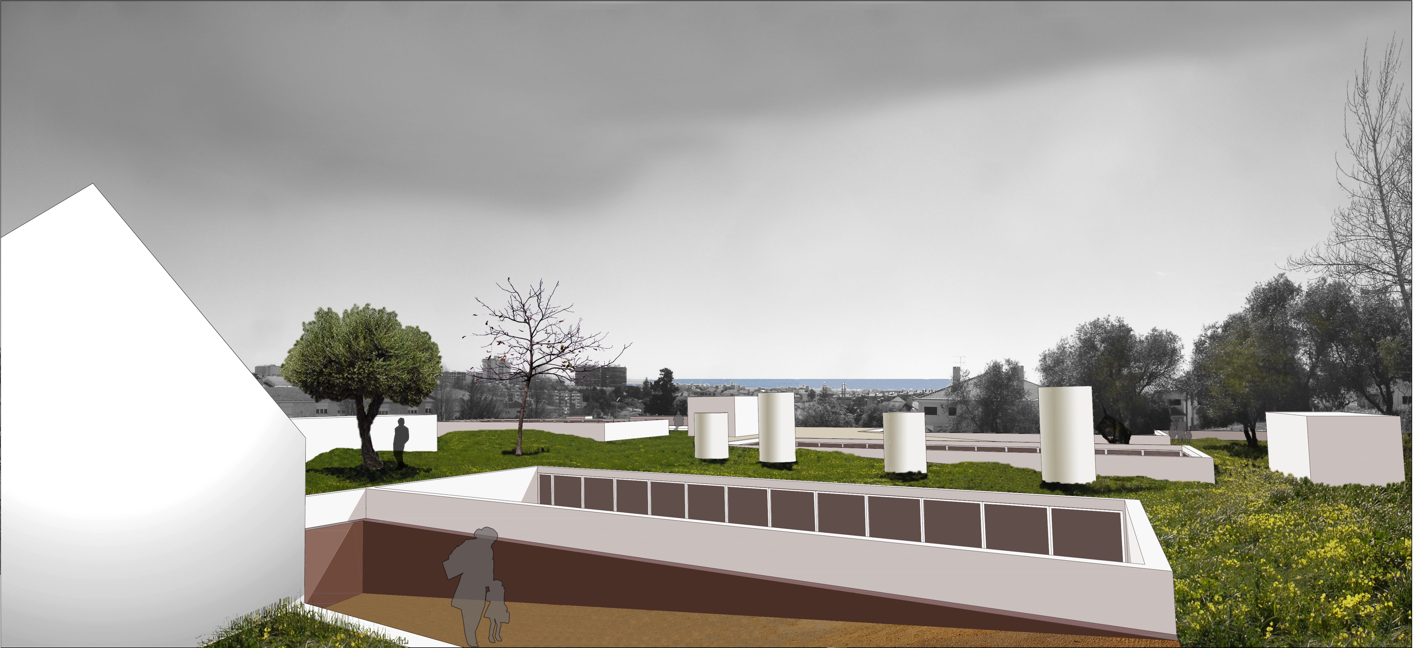
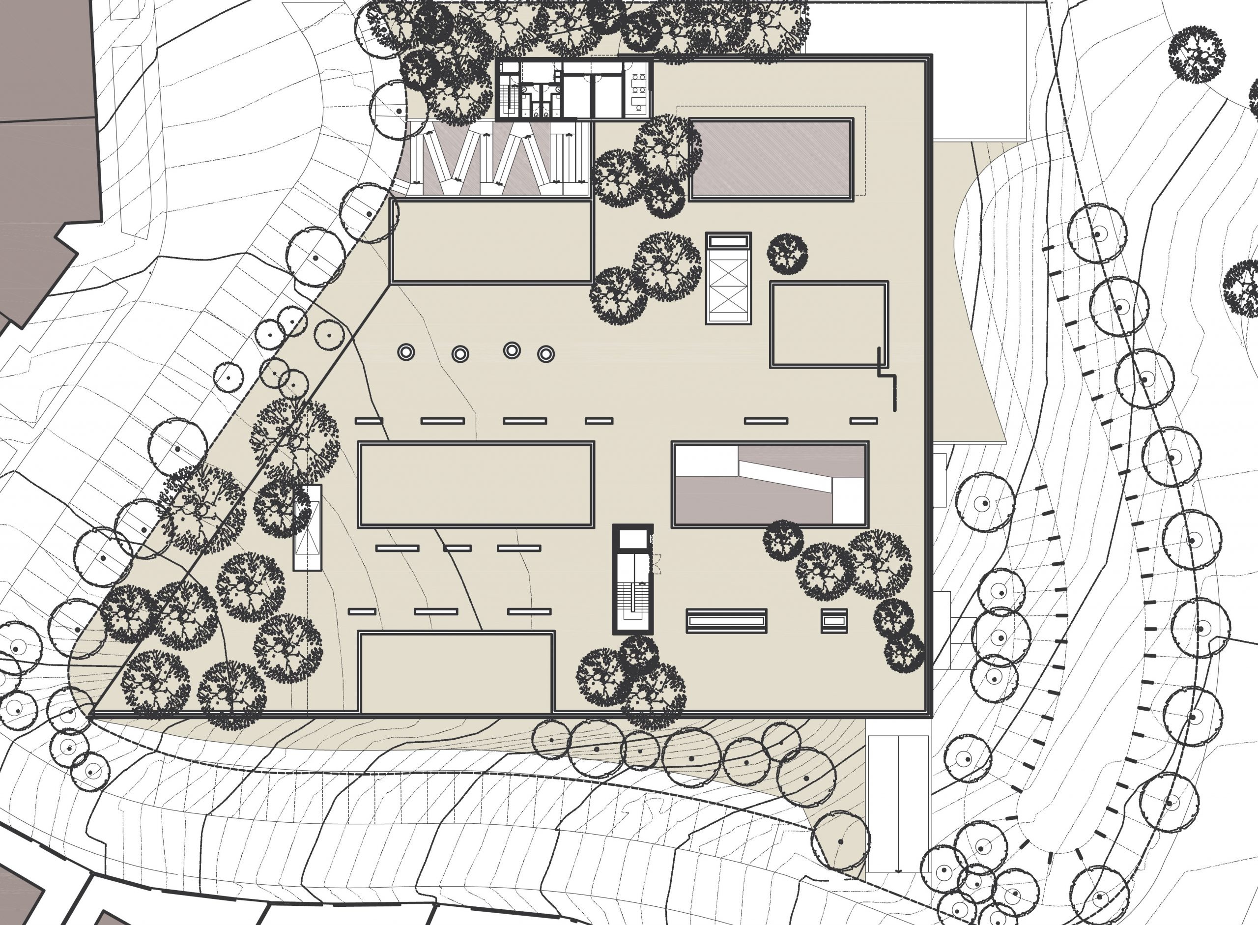
This building should be the link between the different density areas surrounding the plot, but with the proposed three storeys, it wouldn’t adapt to any of these exterior references. The site dimension allows a bigger occupancy by the building. Enlarging the building implantation could reduce its height above the ground to just two storeys and also reduce one underground level. The building would have the same height as the low-density urban front and it wouldn’t rise higher than the street level at the higher density end, making a strong connection at this point of the street with the gardened rooftop creating a pleasant public space on top of the building with remarkable ocean view, framed by the taller buildings on the side.
The nursery school is located on this new rooftop garden where can be also placed public stands and small coffee shops with terraces.
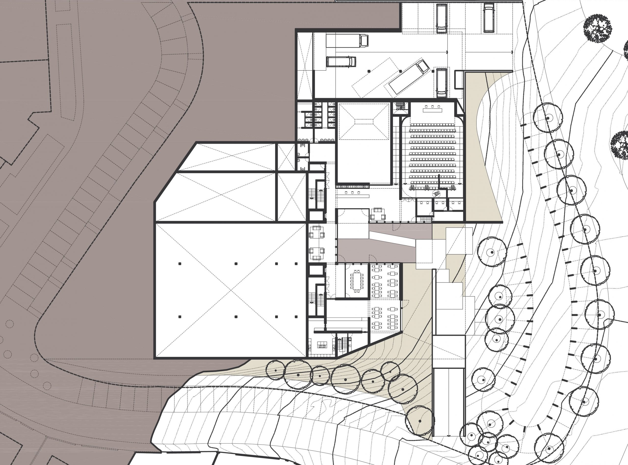
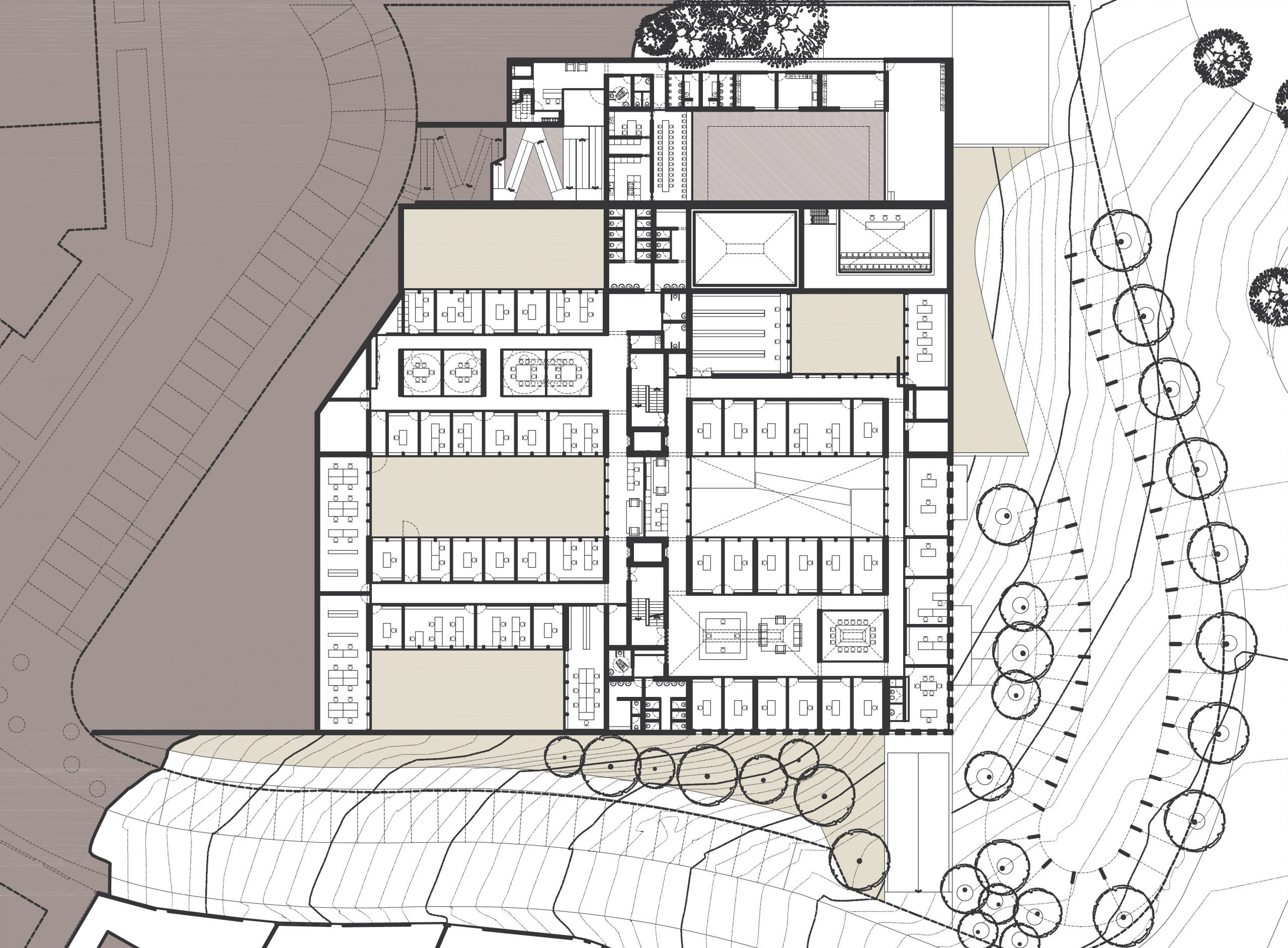
At the interior of the building, big landscaped patios light up every working space with natural light. The building façade ables the building with a serene and intimate relation with the street outside, well adjusted to working spaces and even with the public areas like the auditory and its foyer or the exhibit spaces.
Reducing the building basement levels and stretching the area of implantation makes space for a bigger storage area, indispensable for the AMI work, and optimizes the underground parking scheme offering more parking spaces with less horizontal and vertical circulation.
In order to do this, we widened the building’s footprint, reducing it to two floors. The much wider roof could now be connected to the street of the residential neighborhood at the higher level of the site. The roof became a garden serving that neighborhood while the façades and entrances of the building would relate to the more lively commercial street at the lower level of the plot. The garden at the roof level featured views to the sea, housed the nursery school, and could also frame the higher density buildings on the northern side of the building.
The extensive office spaces and other functions in the interior of the building would be connected to big landscaped patios that spread every working space with natural light and a sense of peacefulness. The building façade raises itself enabling a glimpse of one of the patios, to reveal the entrance through the water mirror, in a serene and intimate indirect relationship with the street outside, well adjusted to public areas that featured a foyer leading to the auditorium, exhibition space, and canteen/cafeteria.
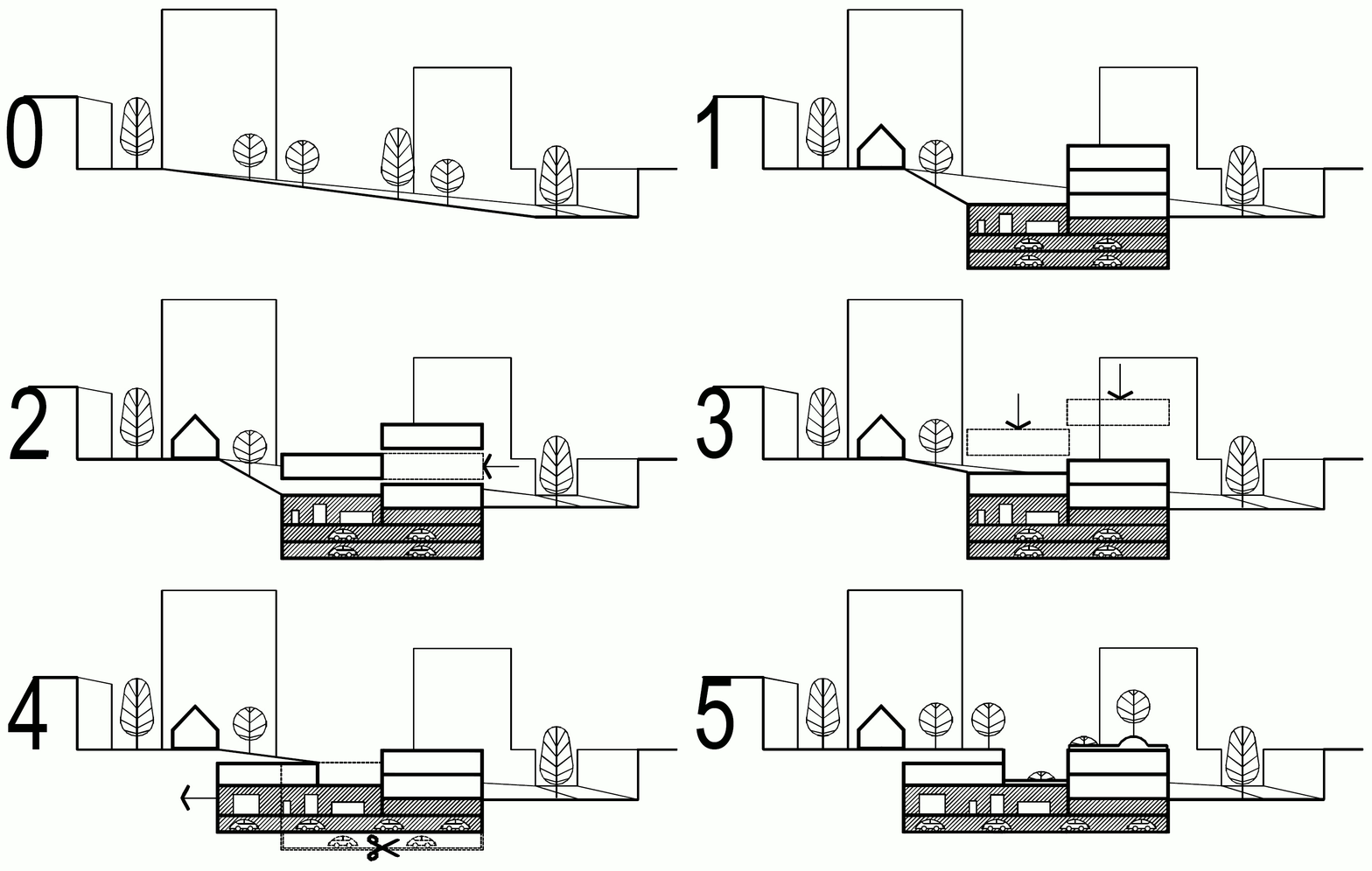
0 AVENIDAS+TERRENO EXISTENTE | 1 CRECHE+OCUPAÇAO VOLUMÉTRICA SEDE| 2 REPOSICIONAMENTO PISO 1 | 3 REDUÇÃO DA CÉRCEA | 4 AUMENTO ÁREA DE IMPLANTAÇÃO – ABERTURA PÁTIOS E REDUÇÃO DE PISOS EM CAVE | 5 COBERTURA E PÁTIOS AJARDINADOS
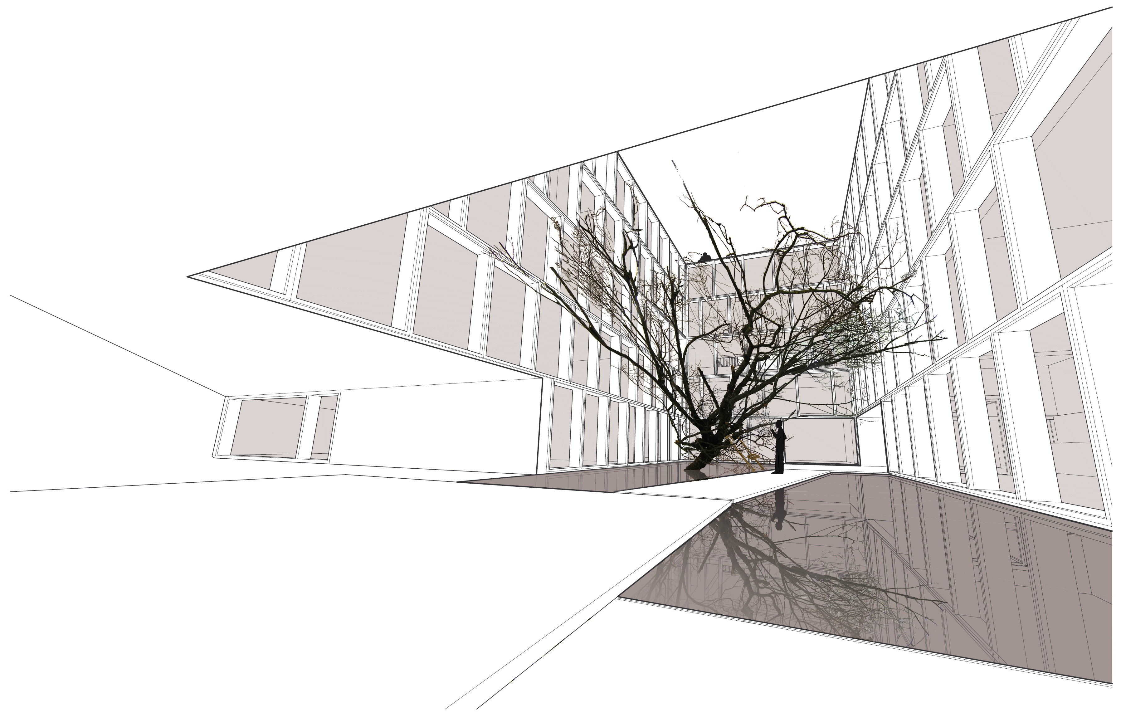
“Árvore” pela artista plástica convidada: Gabriela Albergaria.
