S. Vicente II
The original building is mostly from the 17th century with traces of intervertions made prior to that and the project was comissioned to us already with an undergoing rehabilitation. It was composed of several different apartments, each of them unique in shape and layout. Two of the appartments were to be converted into independent guest houses – S. Vicente I and S. Vicente II.
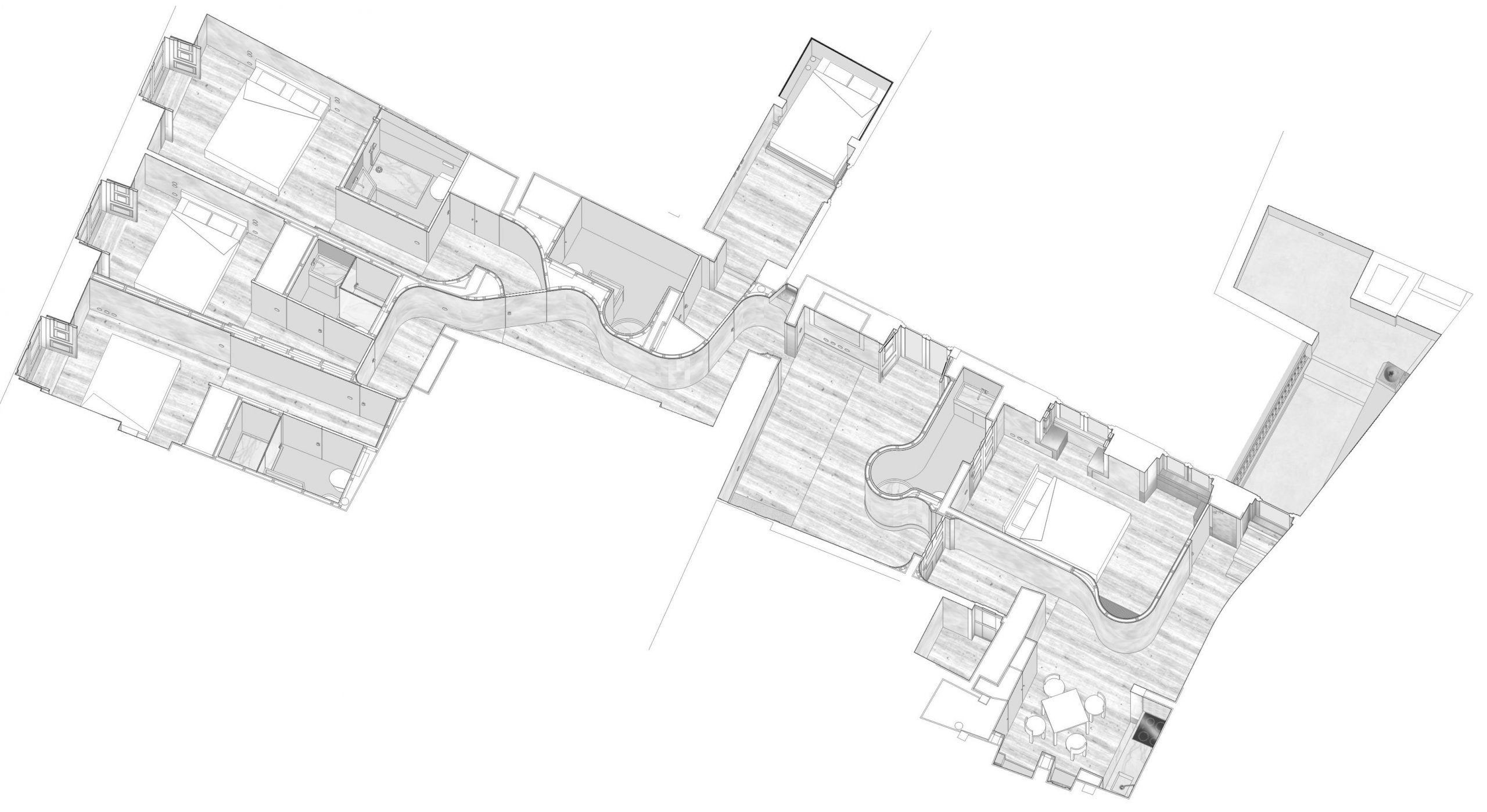
The tourist program for each apartment implied a dense use with 5 suites per apartment, in addition to living space and kitchen shared between guests who would have to be small. This programmatic density would have to be compatible with the existing structure, so it was necessary not to affect the vast majority of the partition walls and interior openings, since they are, together with the facade, the structure of a building of this type. This implied a great effort to reuse the existing spatial geometry.
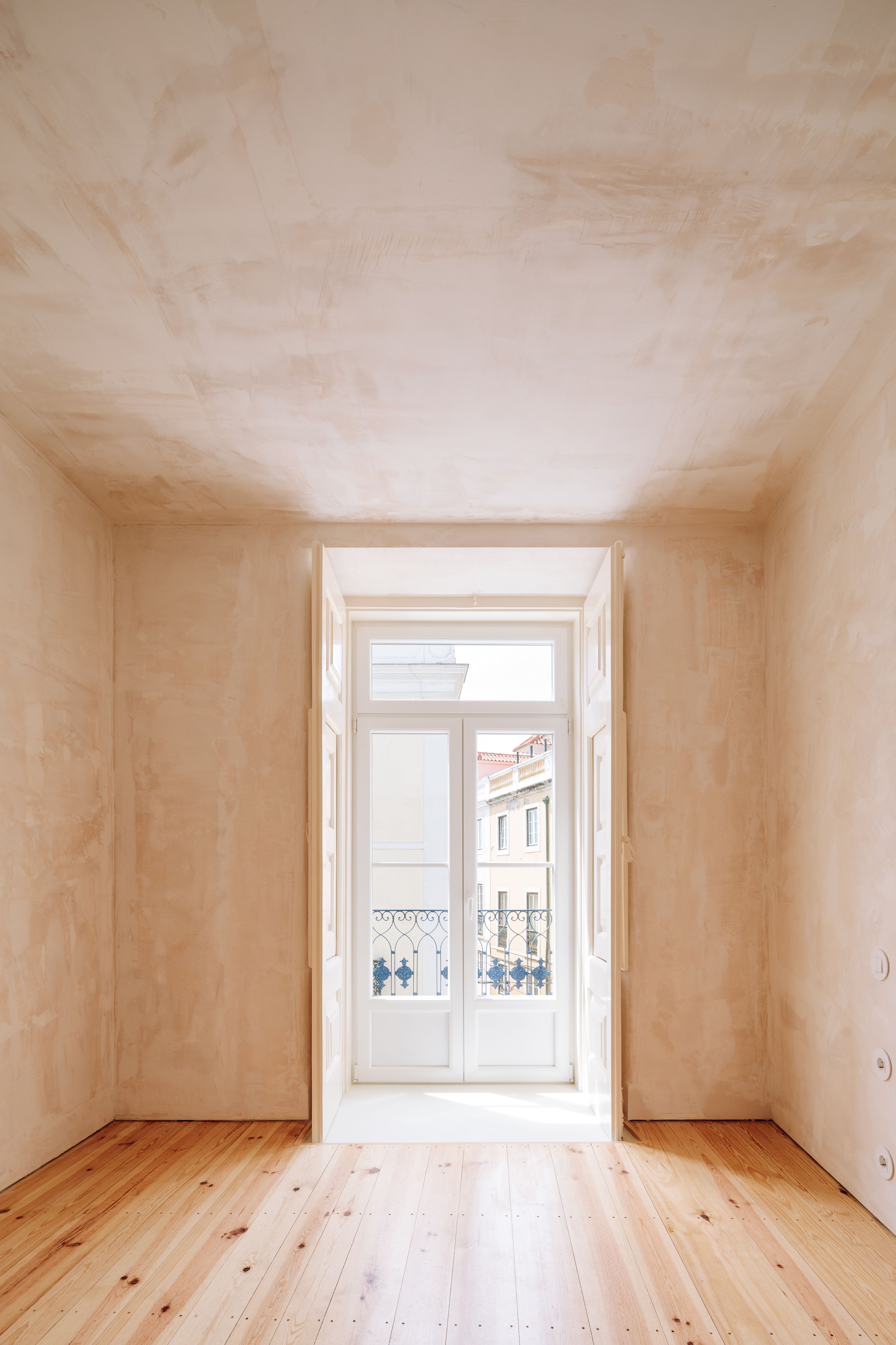
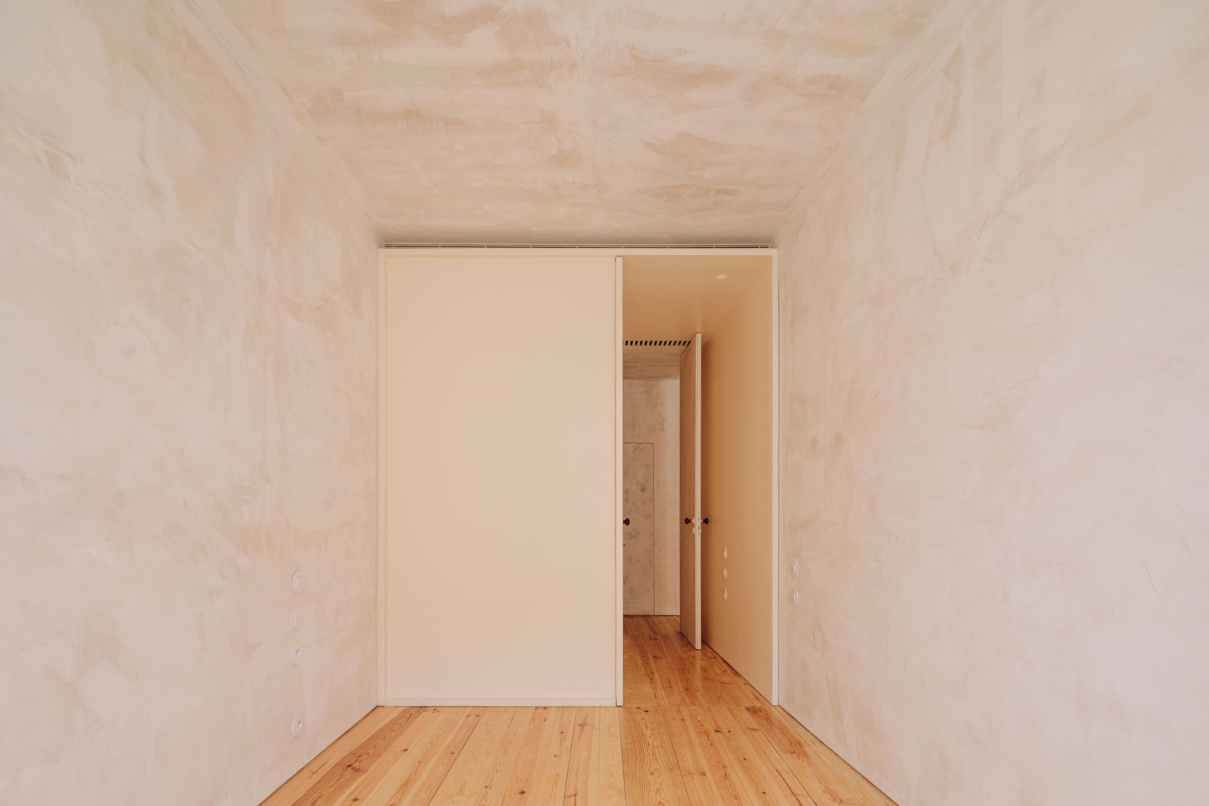
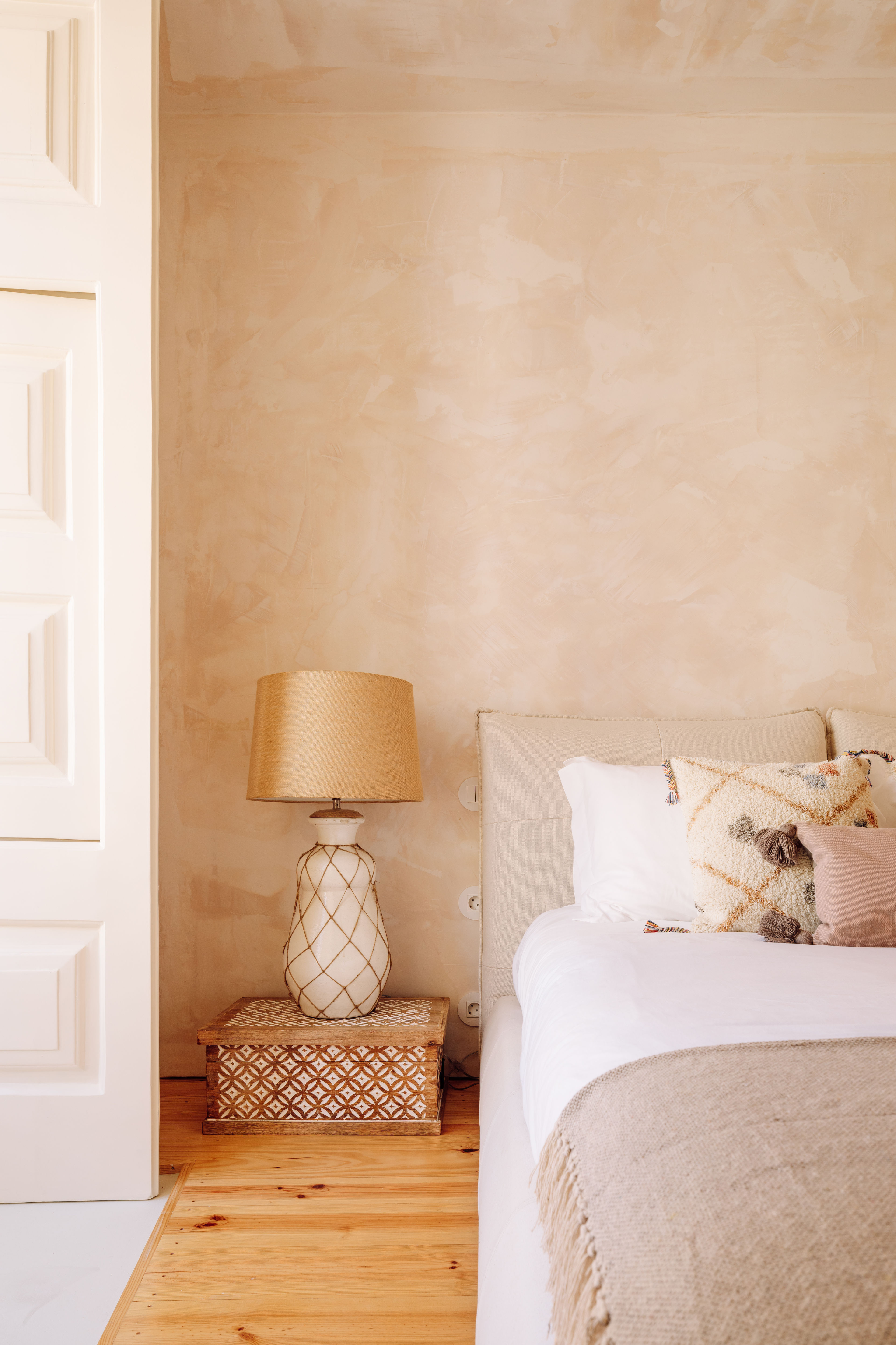
The two overlapping apartments to be used for tourism had a similar base structure that required a similar intervention methodology, construction system, and materiality that were defined, based on the maintenance and potential for enhancement of their patrimonial value. The original materials of wood, lime plaster and stucco were reused as base materials and new lightweight partition systems that could minimize structural intervention and minimum load for new partitions which still could guarantee the waterproofing of the new bathrooms, sound barrier, and fire resistance between rooms. It was key to the project the aim to keep as most as the original construction possible and to optimize new construction as much as possible for both interventions. A requirement we had towards the touristic program was allow reversibility of the construction in the long term if it was to be turned into a residential one. The 5 suites could then turn into a more conventional typology, with fewer bedrooms and wider and better social areas for a regular family apartment.
Even if the conceputal background for the two apartments was the same, small differences between both apartments significantly altered the intervention logic and resulted in two. The 1st-floor apartment had access to a patio and the 2nd-floor apartment to a balcony that looked over the 1st-floor patio. These accesses were located at different points of the floor plans. The distribution of rooms was slightly different between both in terms of geometry and openings location. These two factors were sufficient for the backbone of the two apartments to be different.
The following discription is about the 2nd floor apartment. If you want to see the 1st floor take a look here.
The 2nd floor
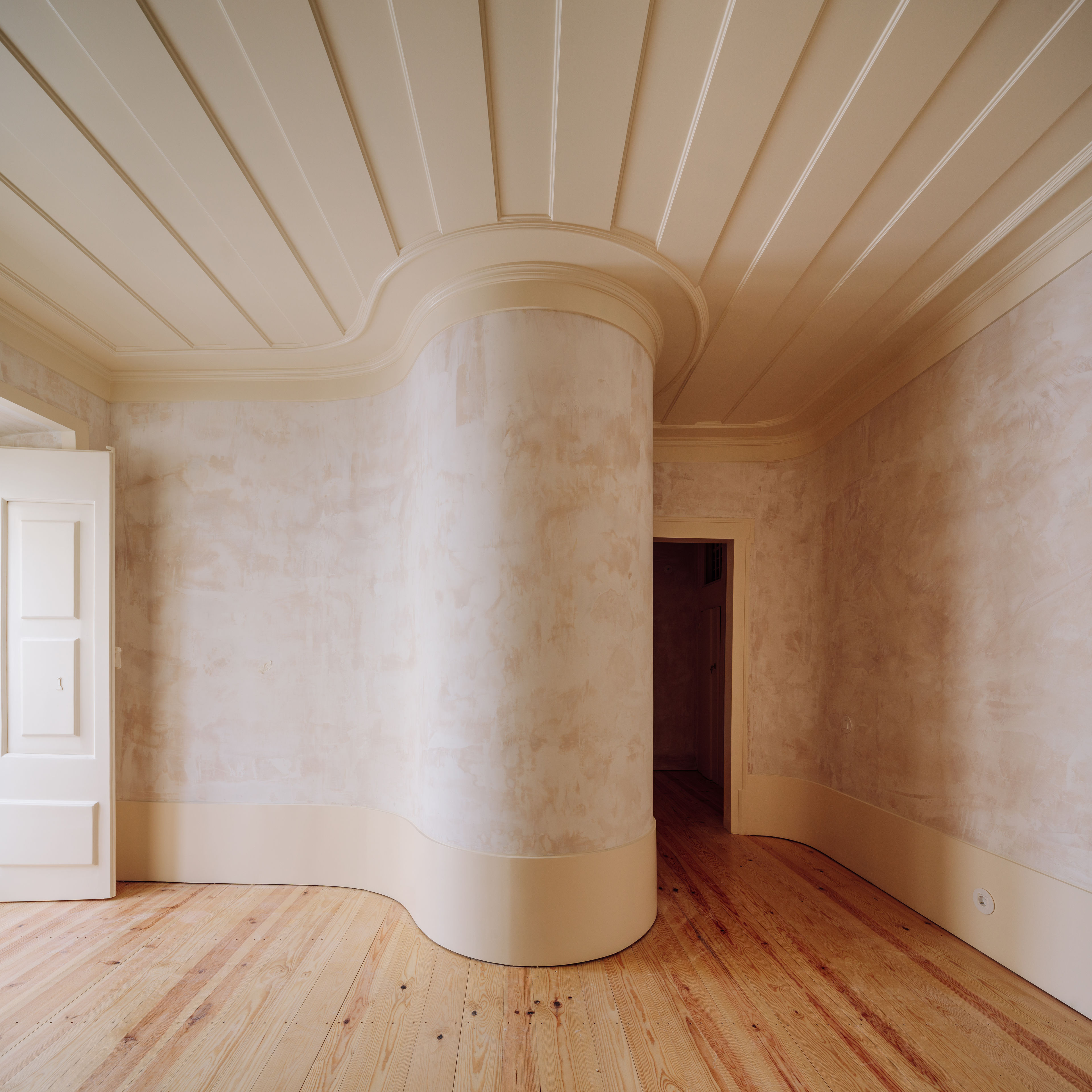
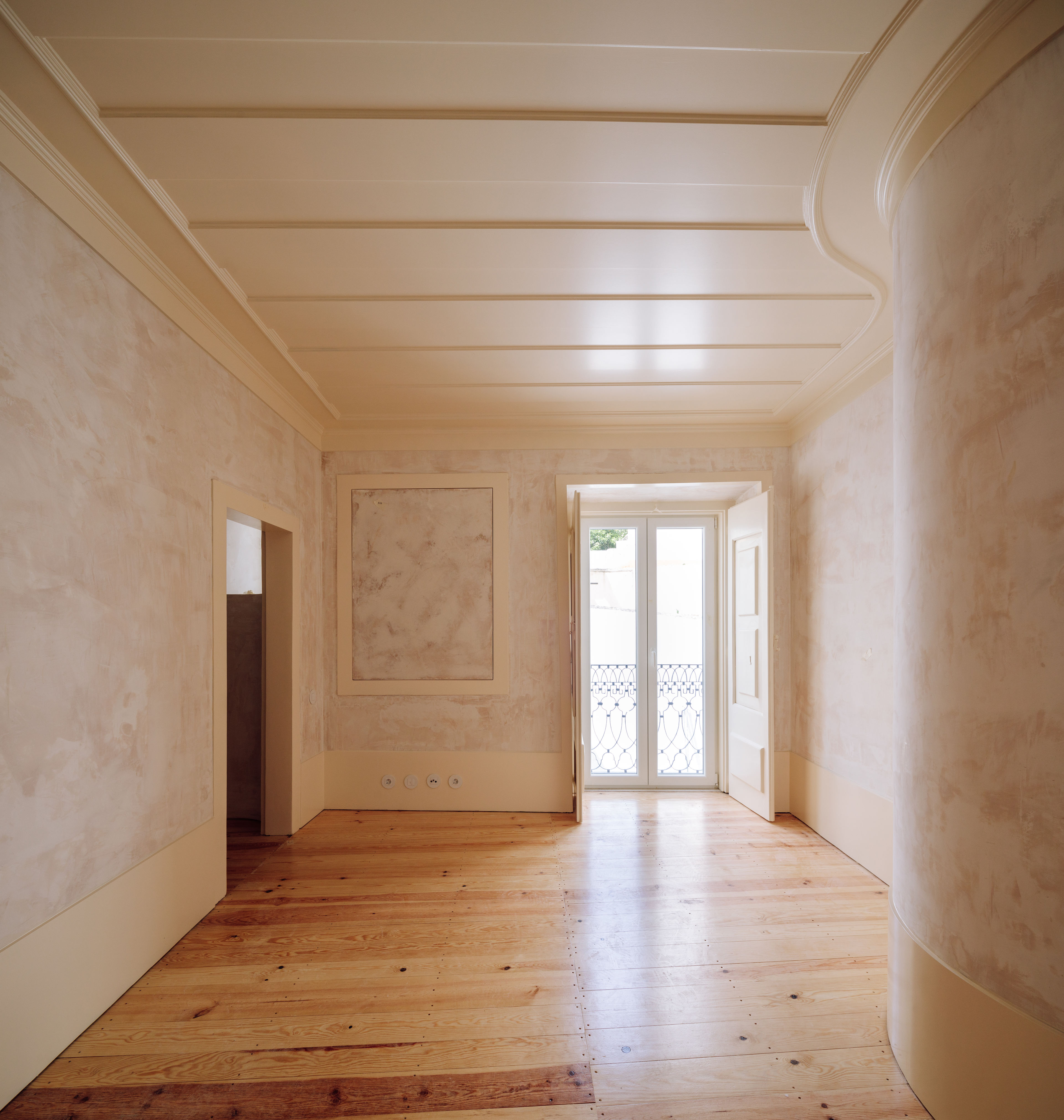
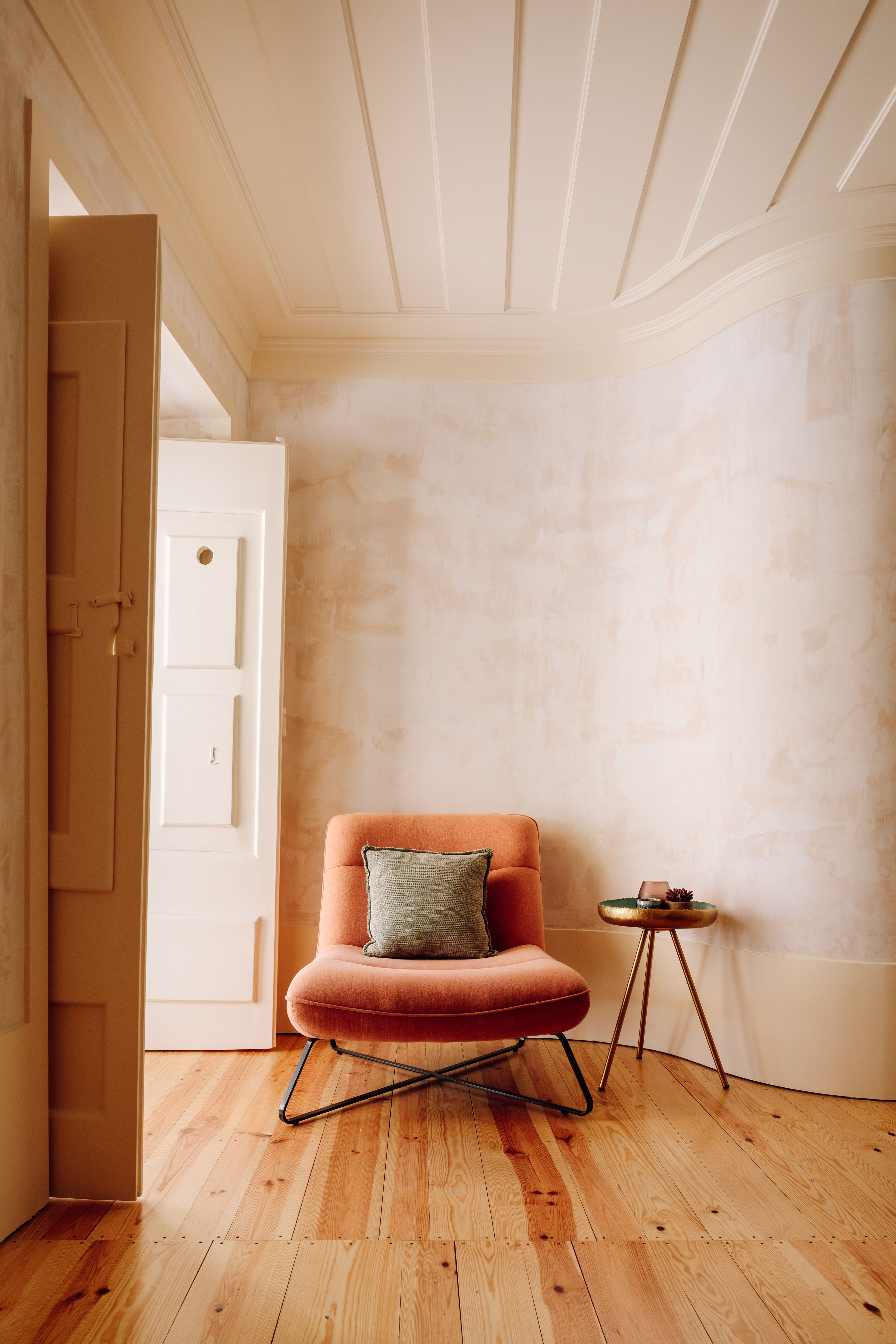
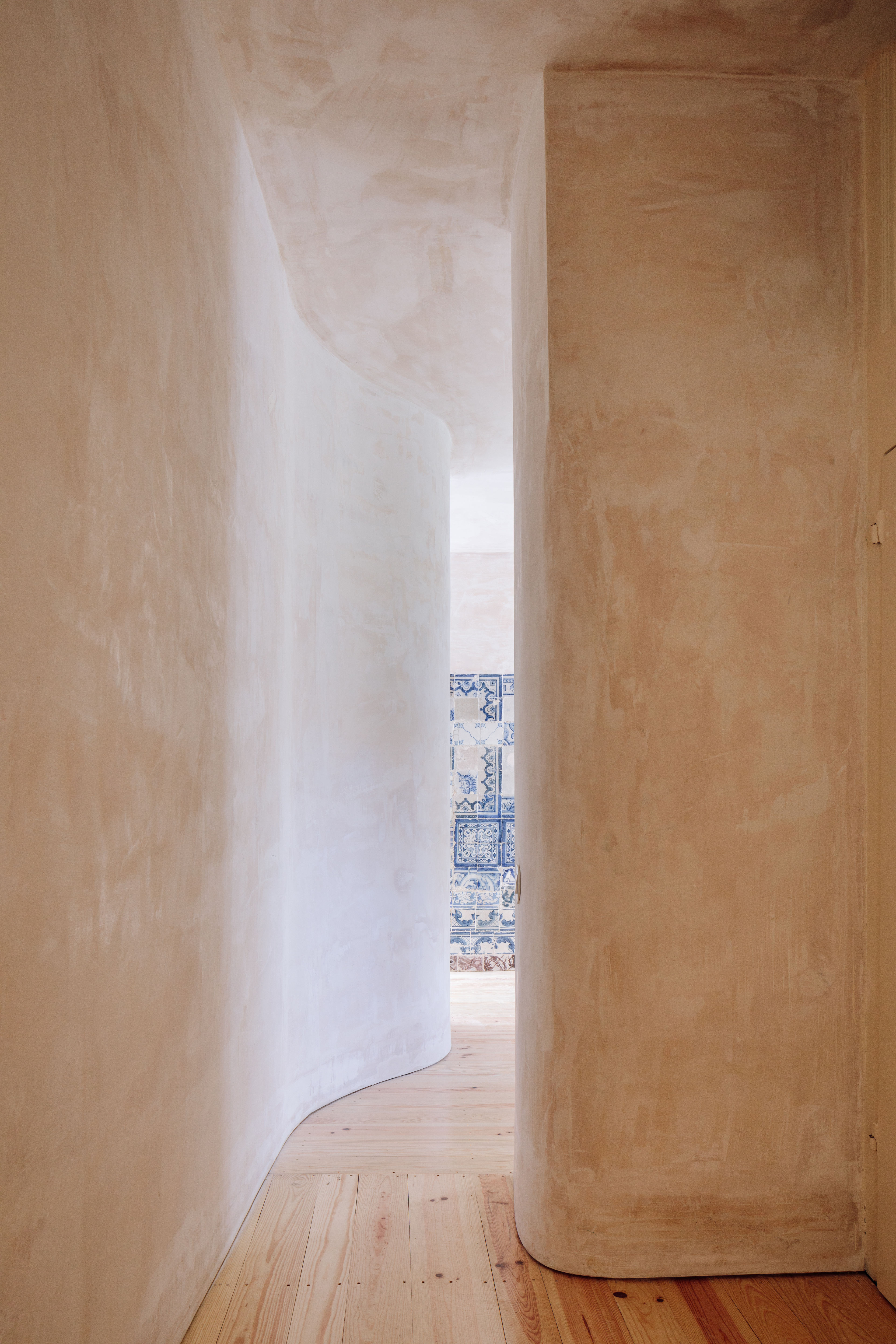
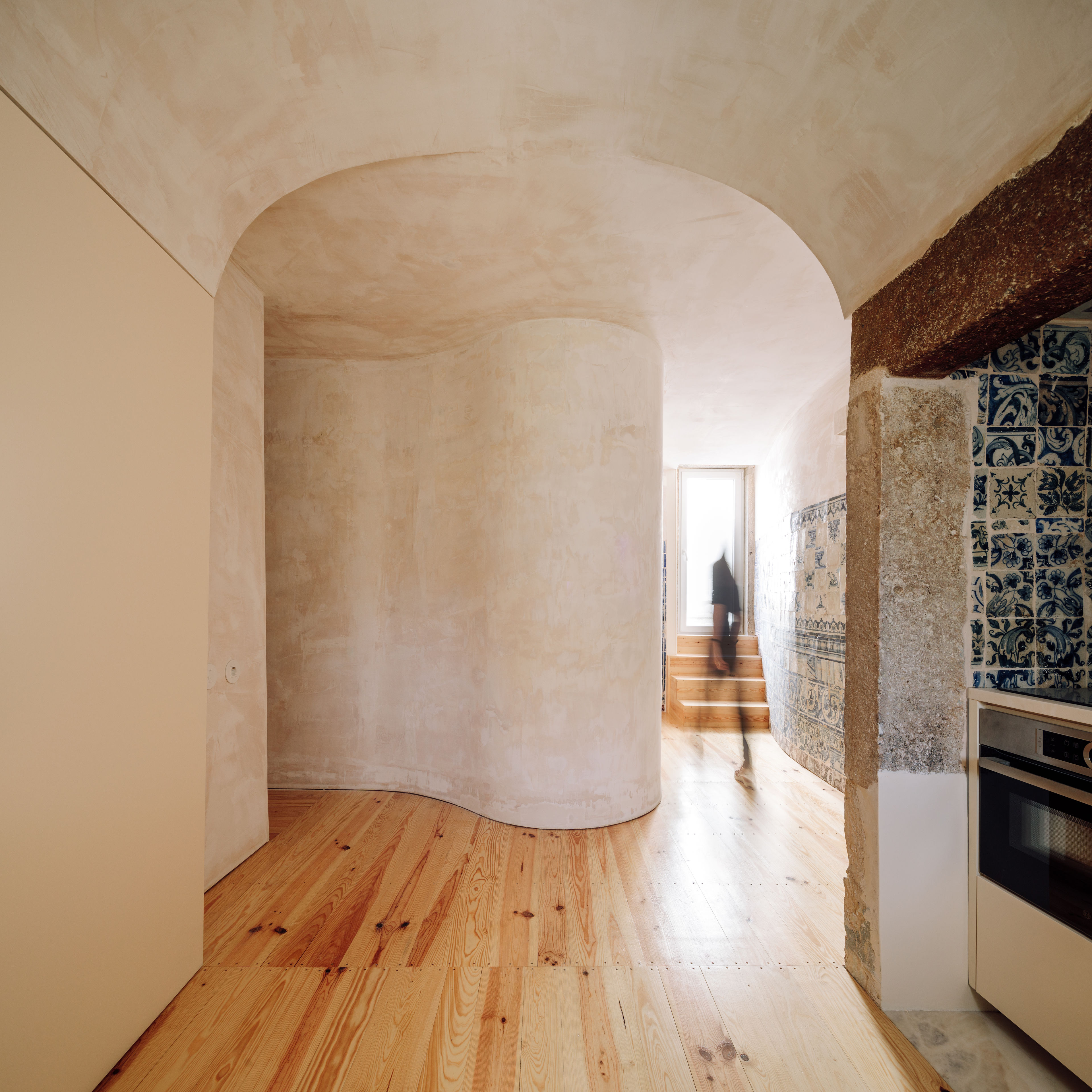
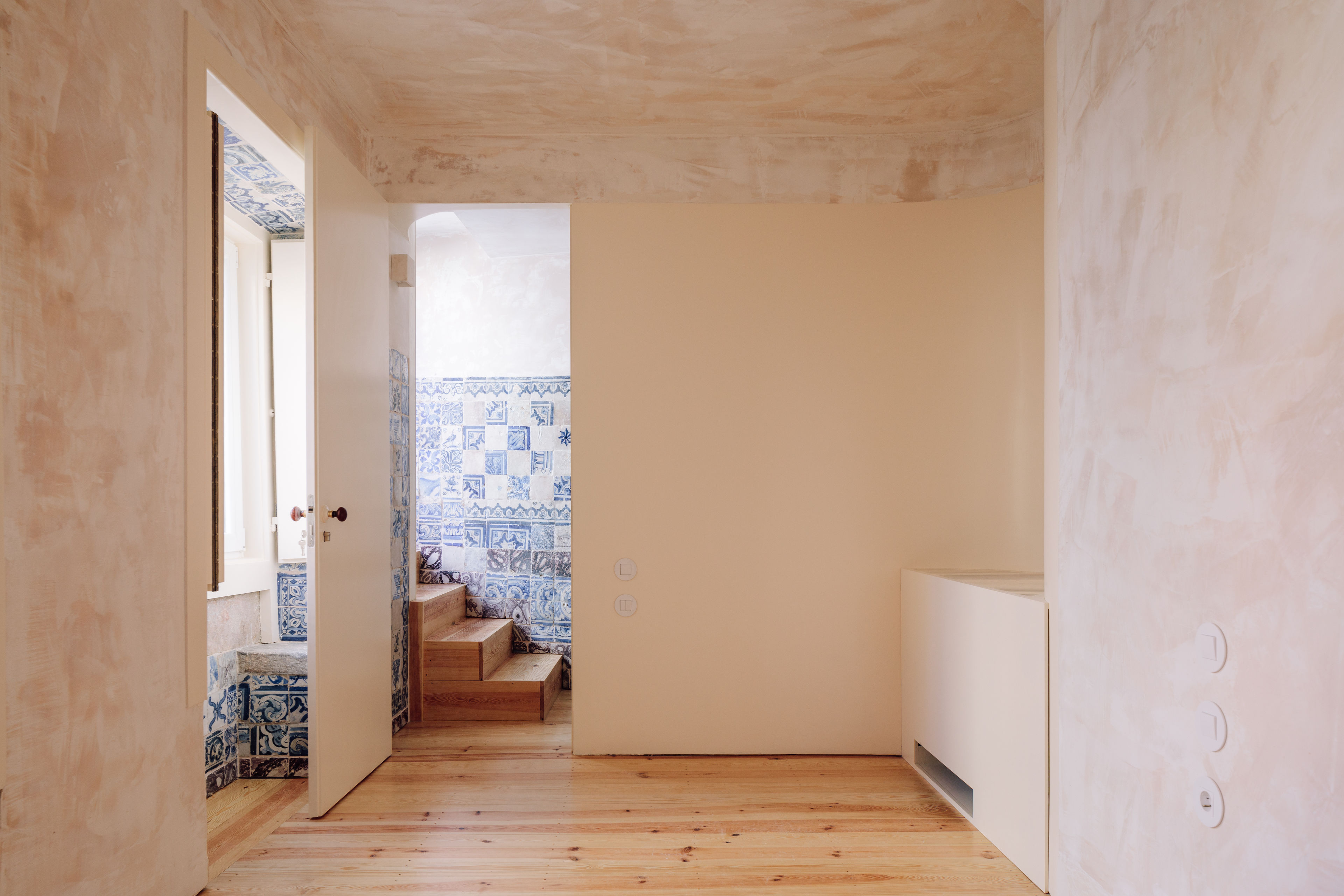
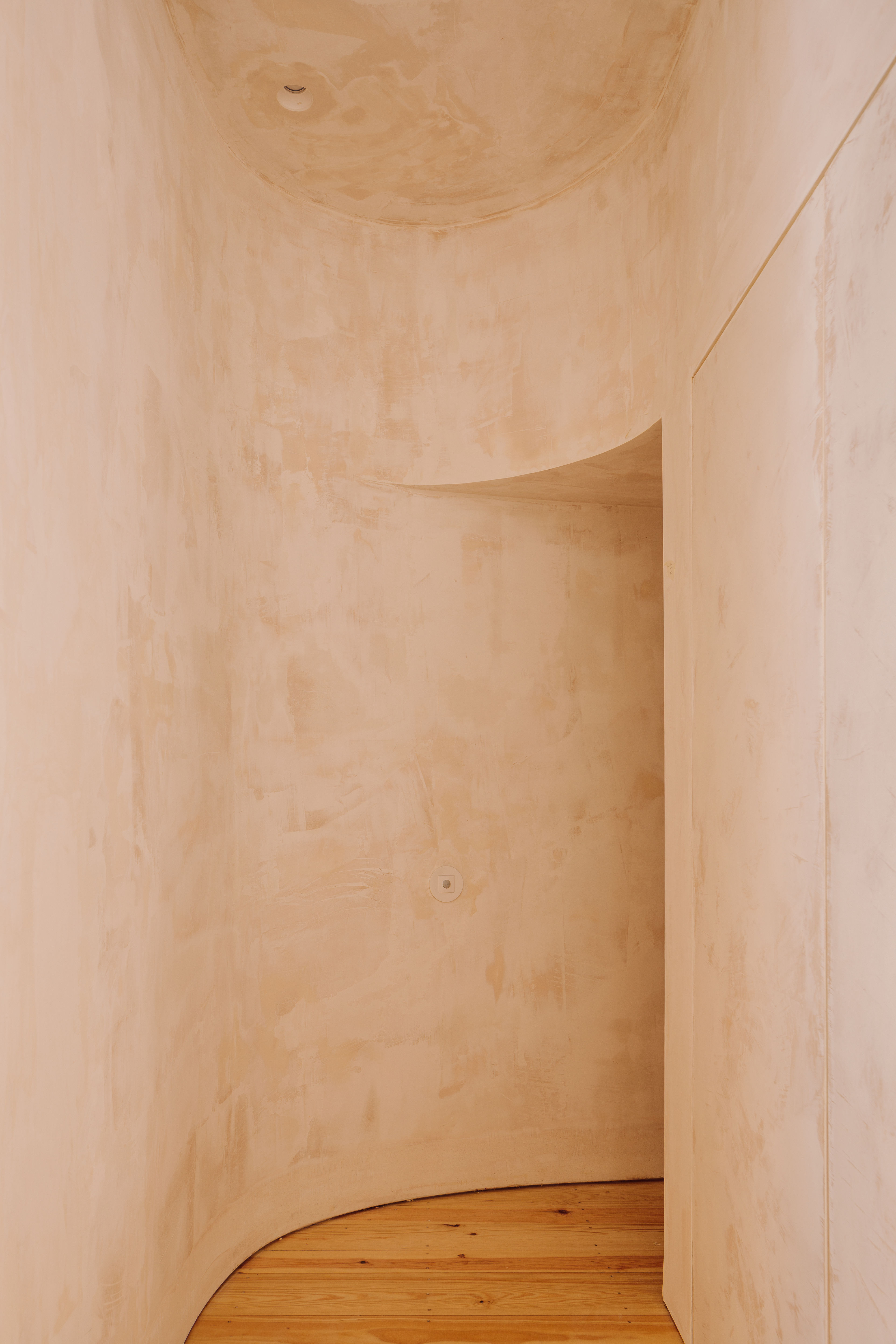
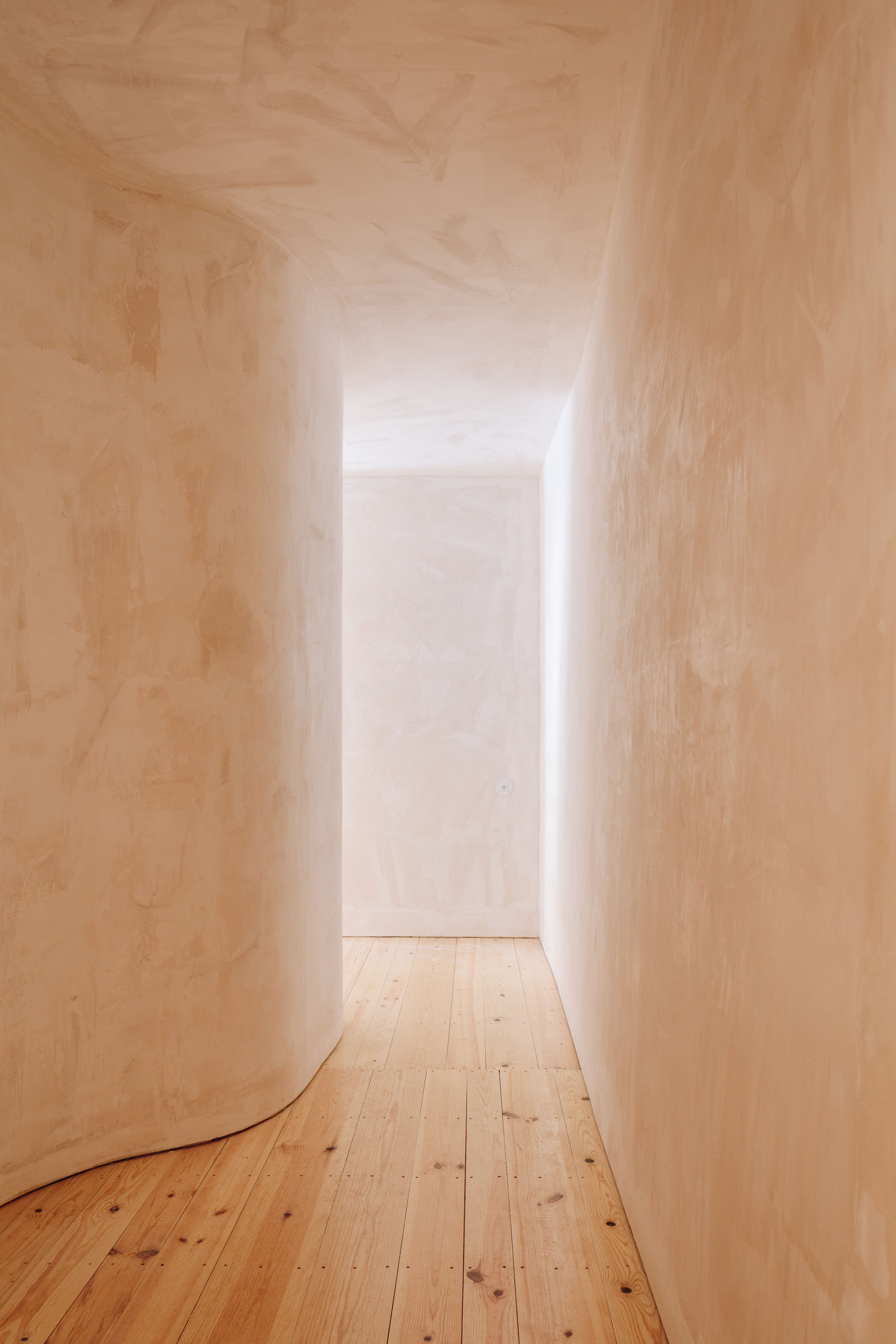
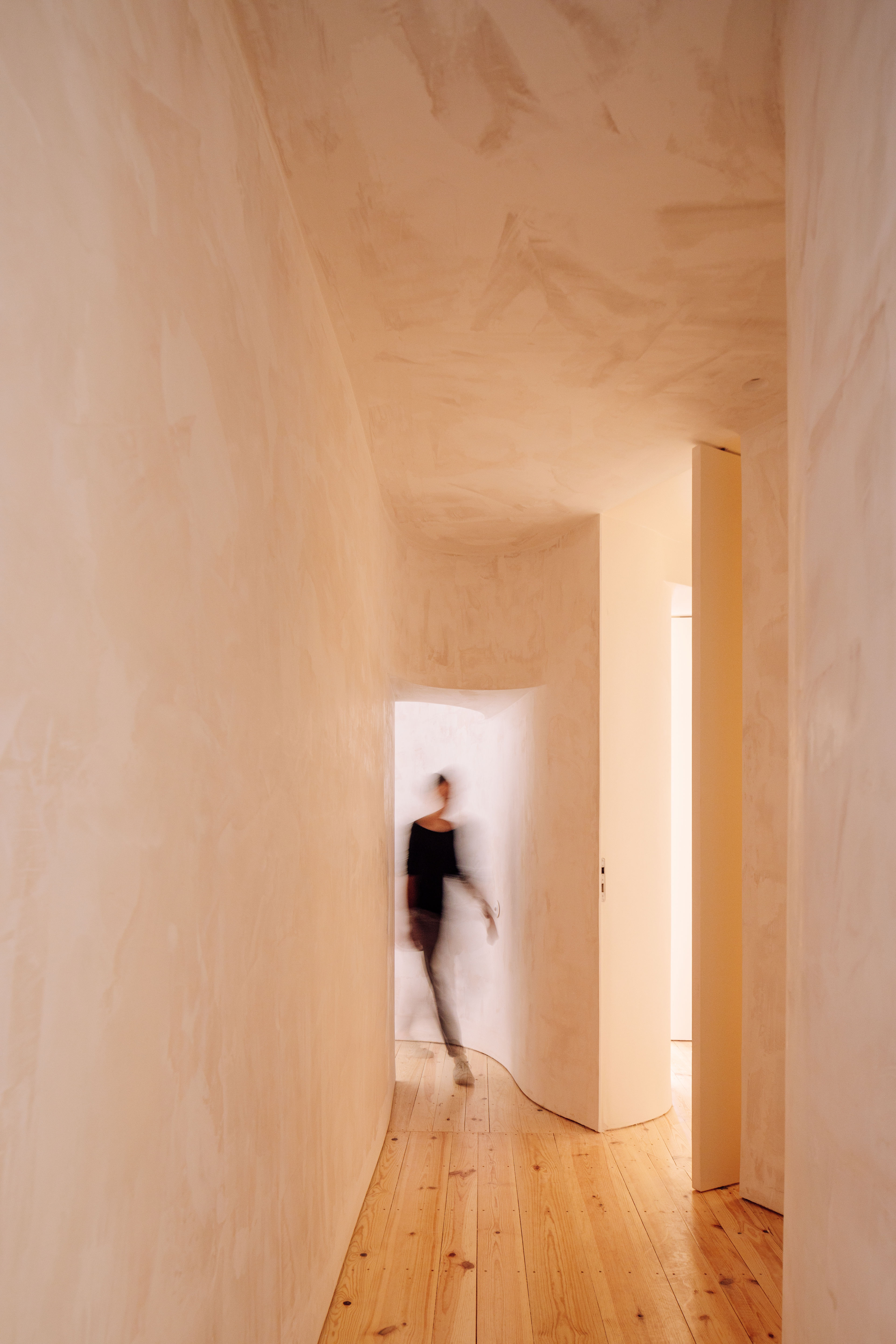
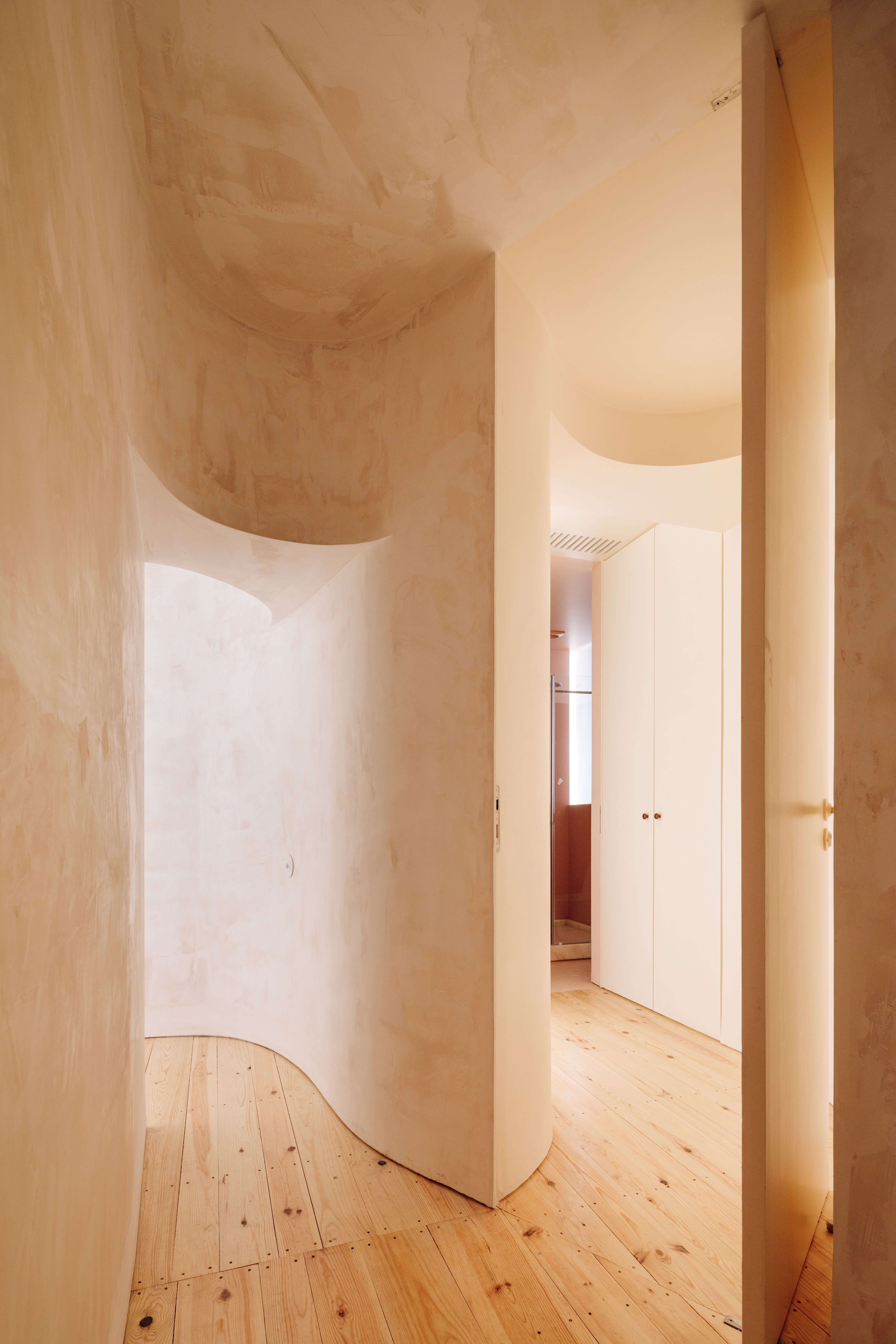
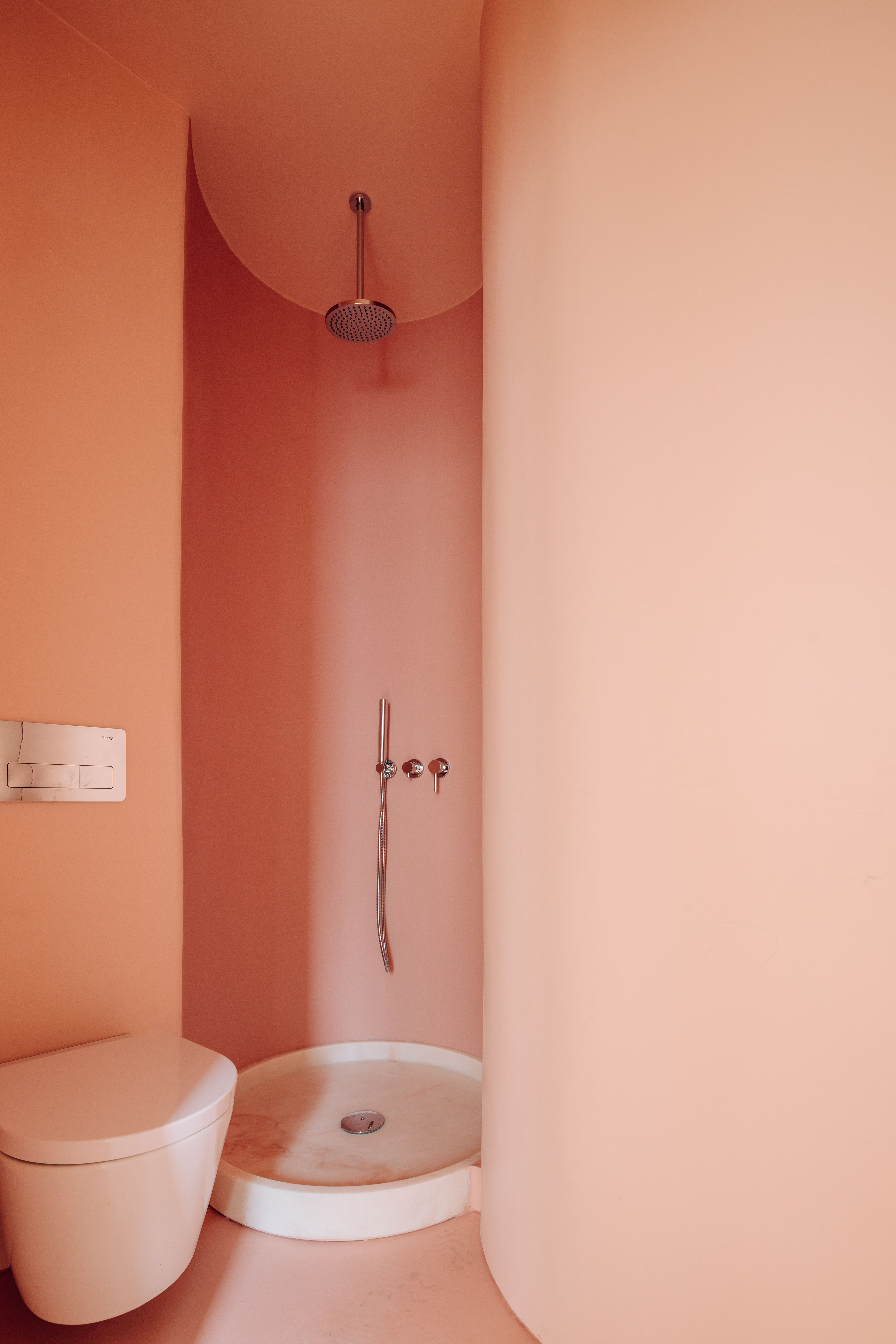
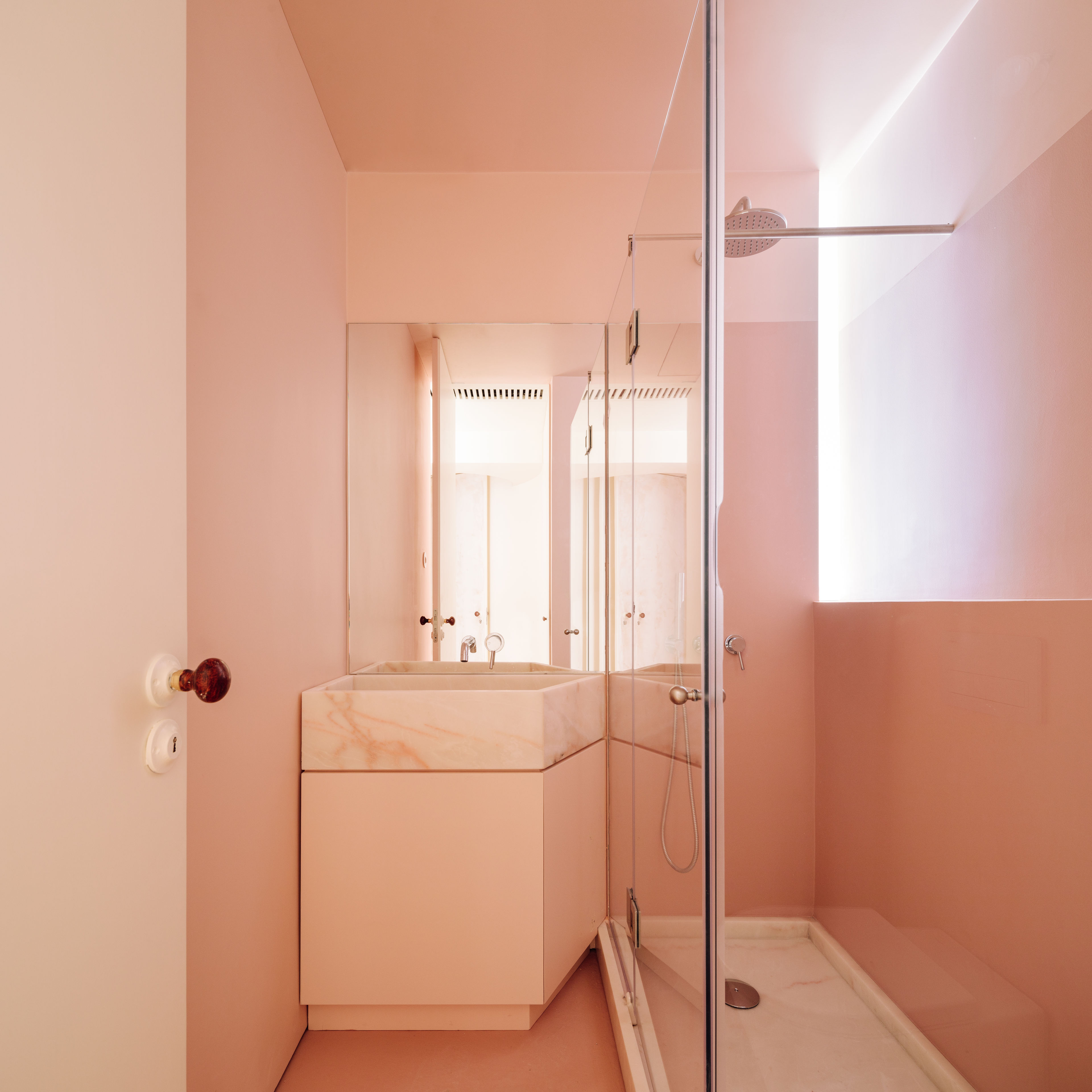
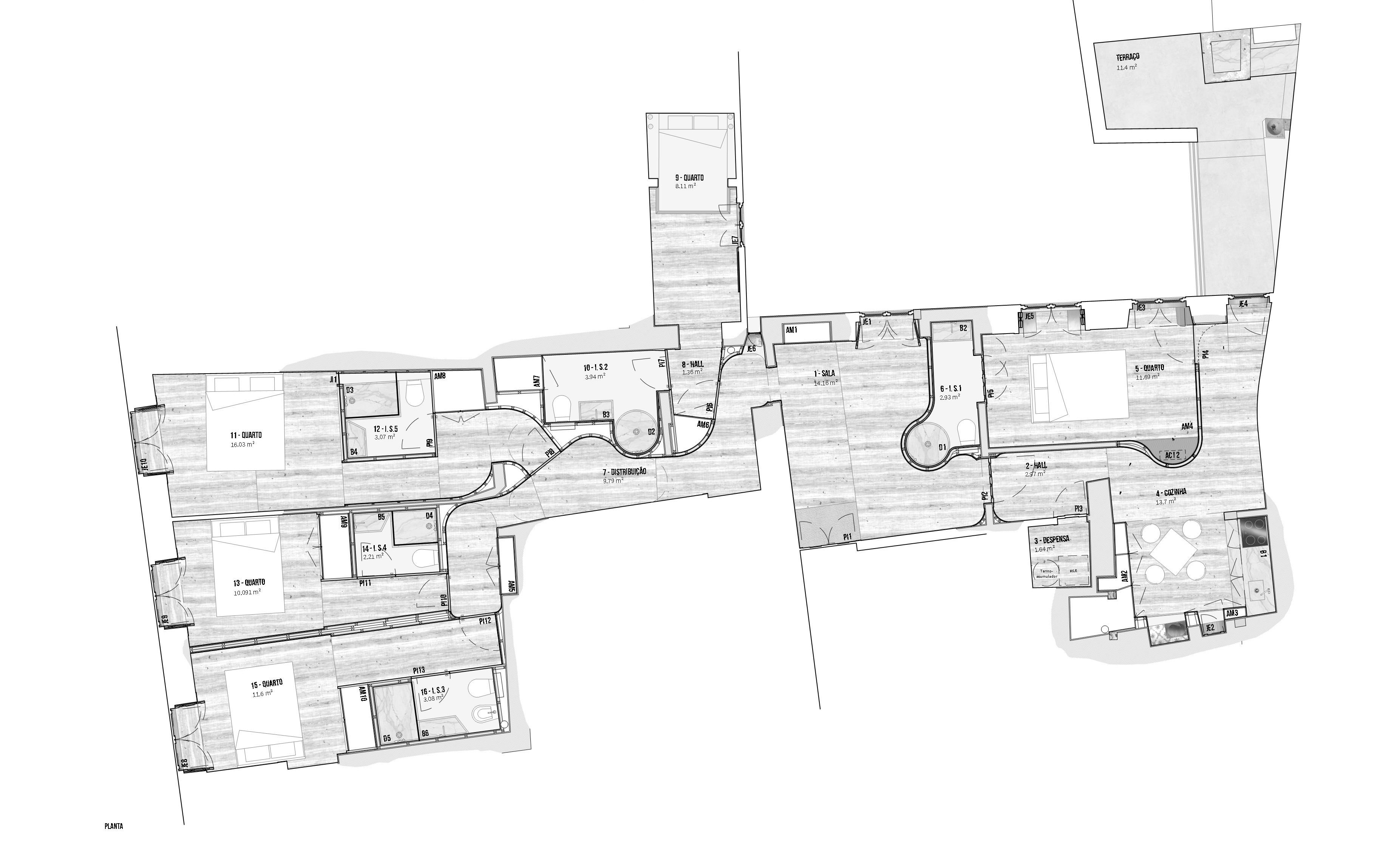
In this apartment partitions were very intricate which made the creation of new closets and bathrooms very intrusive in the social and circulation spaces. The solution was to use curves to sculpt these new functions, removing as much volume to them as possible and deliver it to the social spaces. This inflection of private spaces happened wherever possible and the resulting curve generated spaces in the social areas where living could appear in a contained but welcoming way or in the form of more fluid circulation spaces. These curves also contributed to make natural light flow along the walls and spaces that would otherwise be interior, uncharacterized, and illuminated only by artificial lighting.
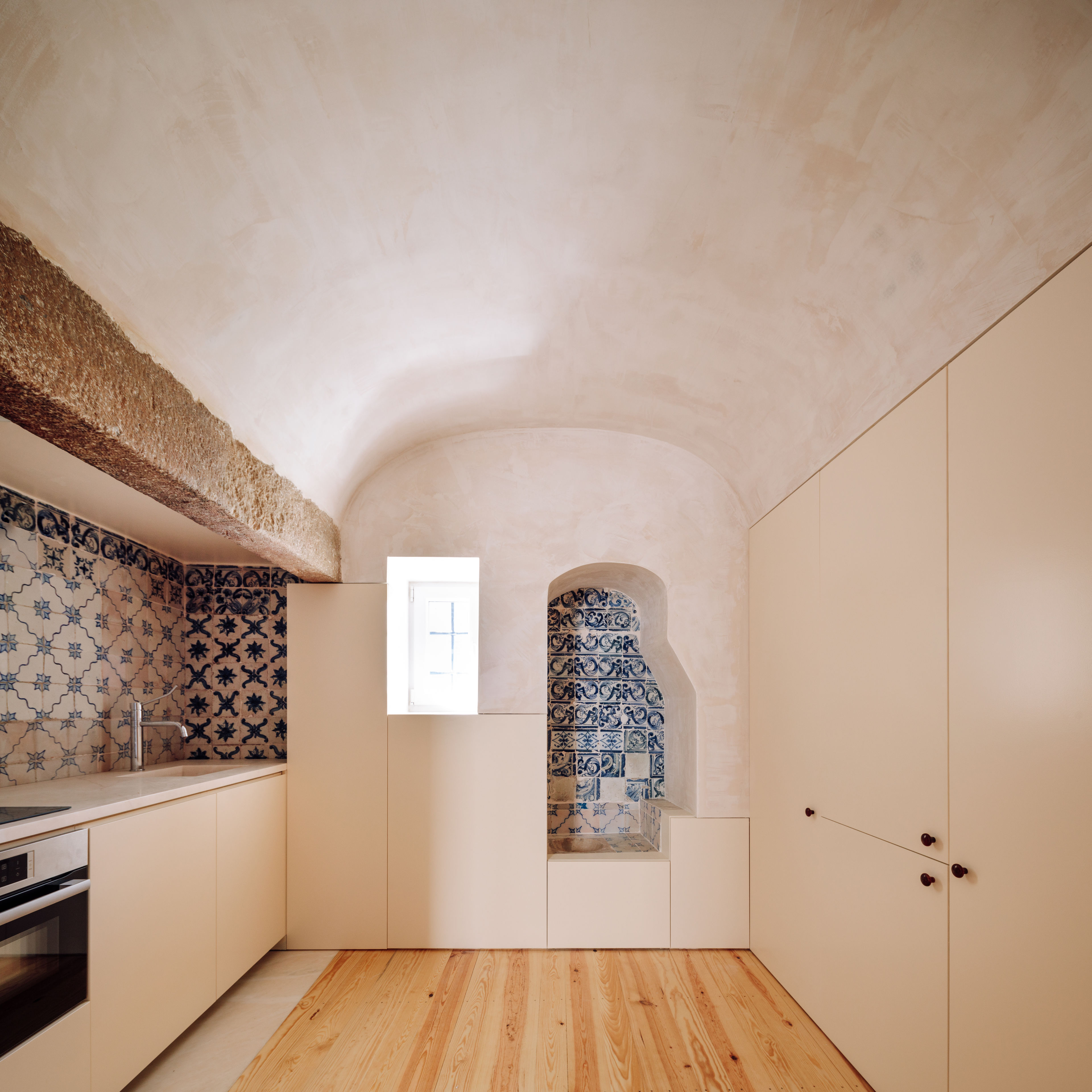
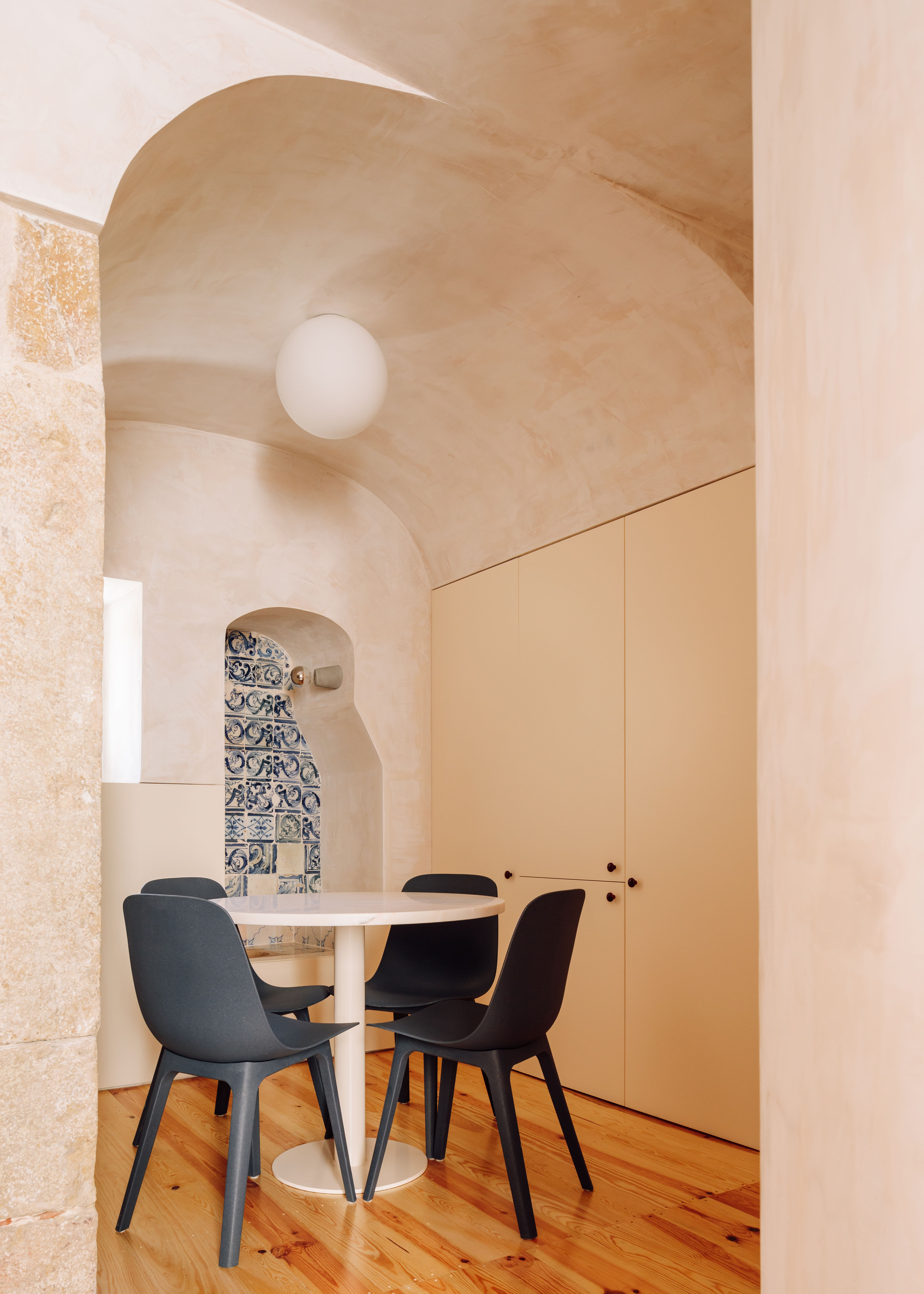
This curve logic was especially useful to integrate a bathroom into the only possible living space in the apartment. A round shower was designed to fit the least amount of space possible and a bathroom of small proportions into the space of the entrance hall. In the same room, these curves helped integrating a small closet and extra space, into the space of the kitchen.
All other rooms fit seamlessly into the existing geometry, with bathrooms and closets integrated in the most interior spaces.
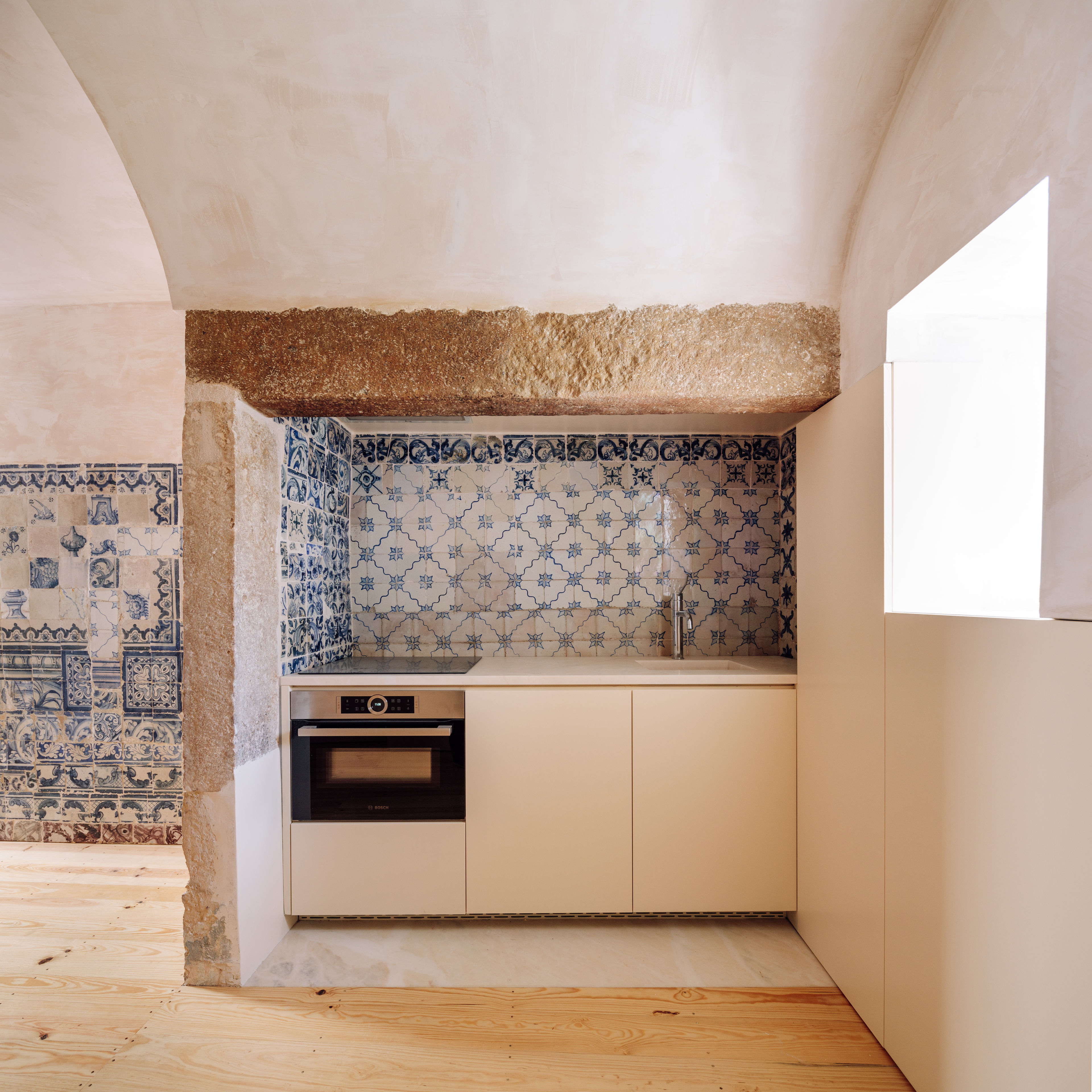
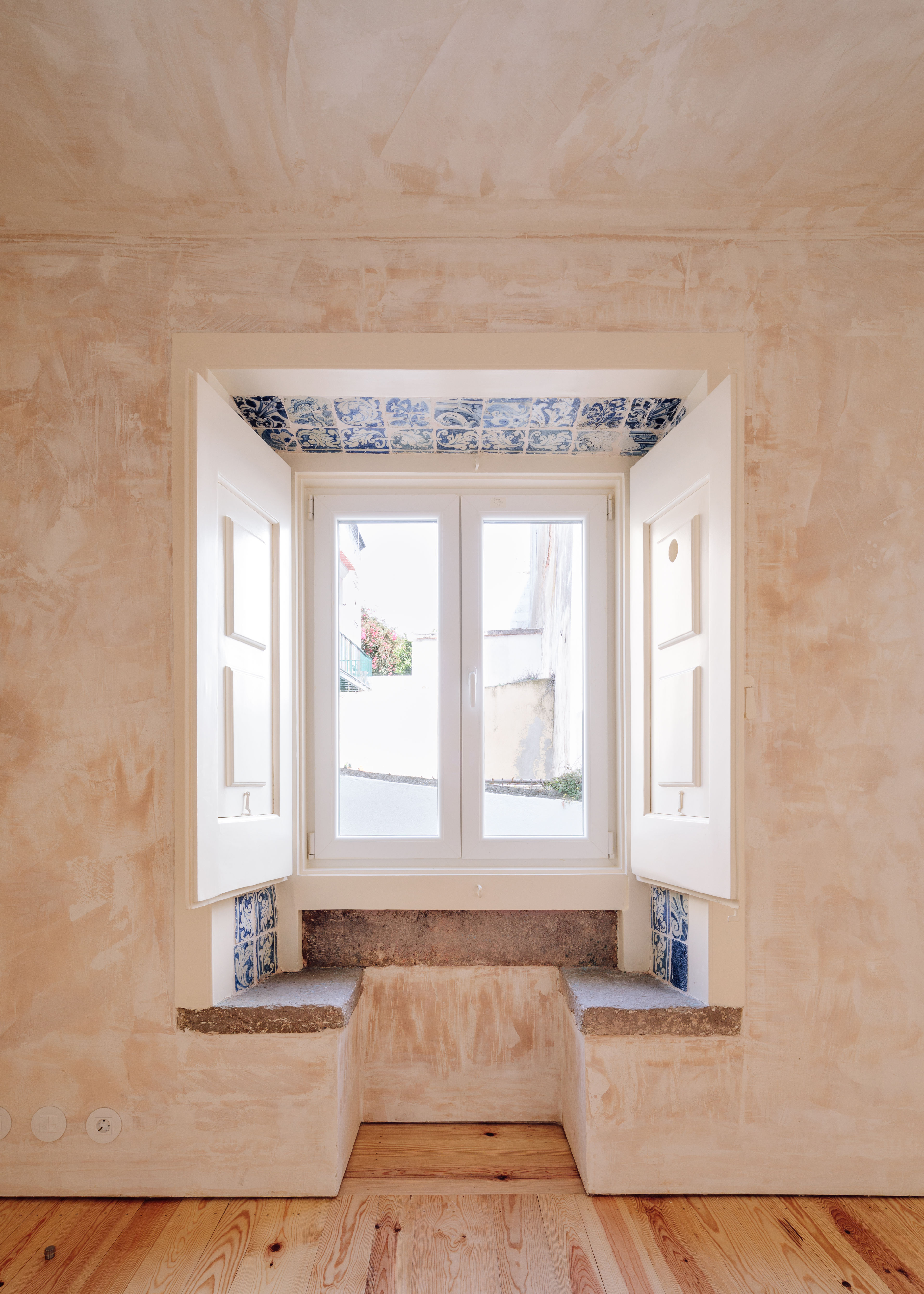
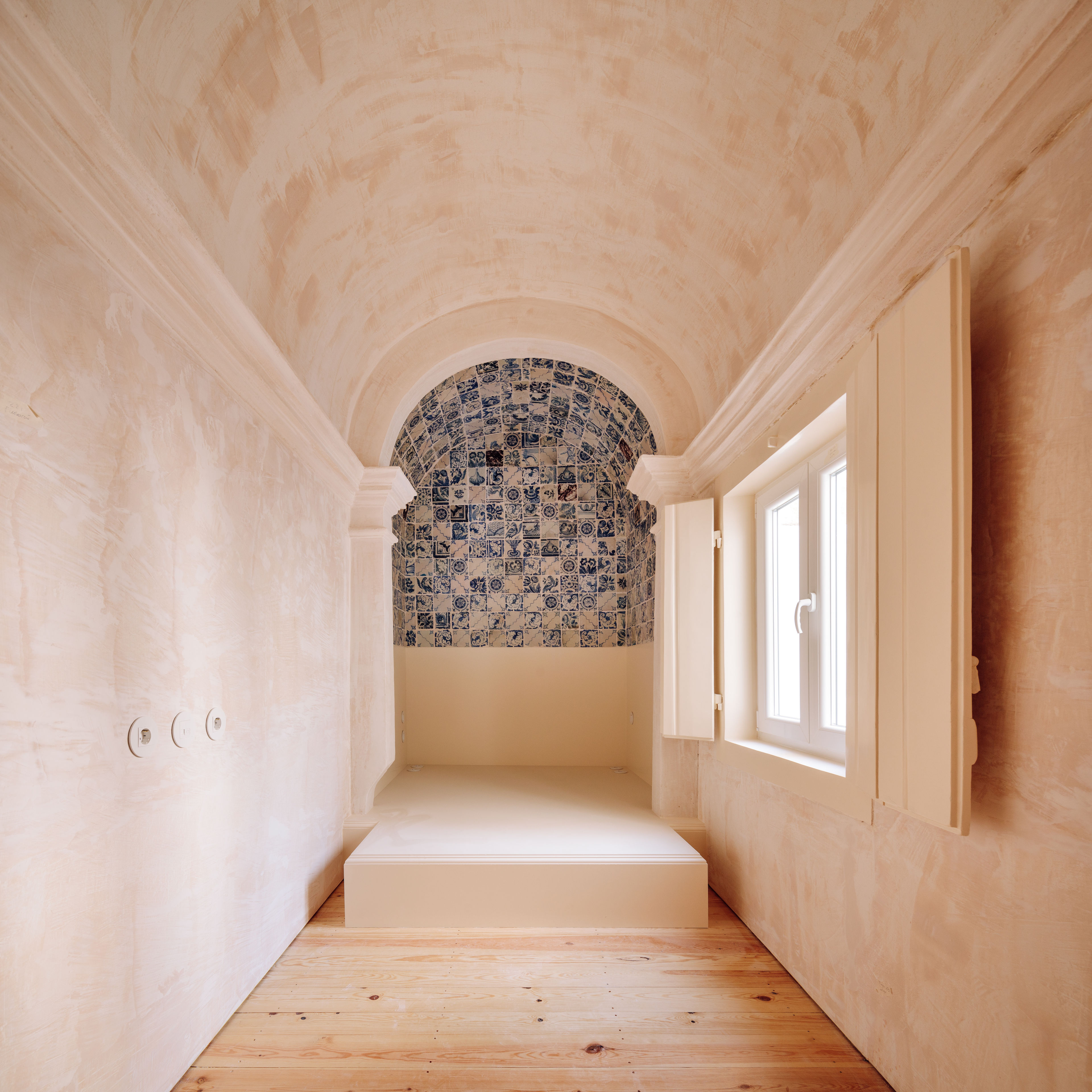
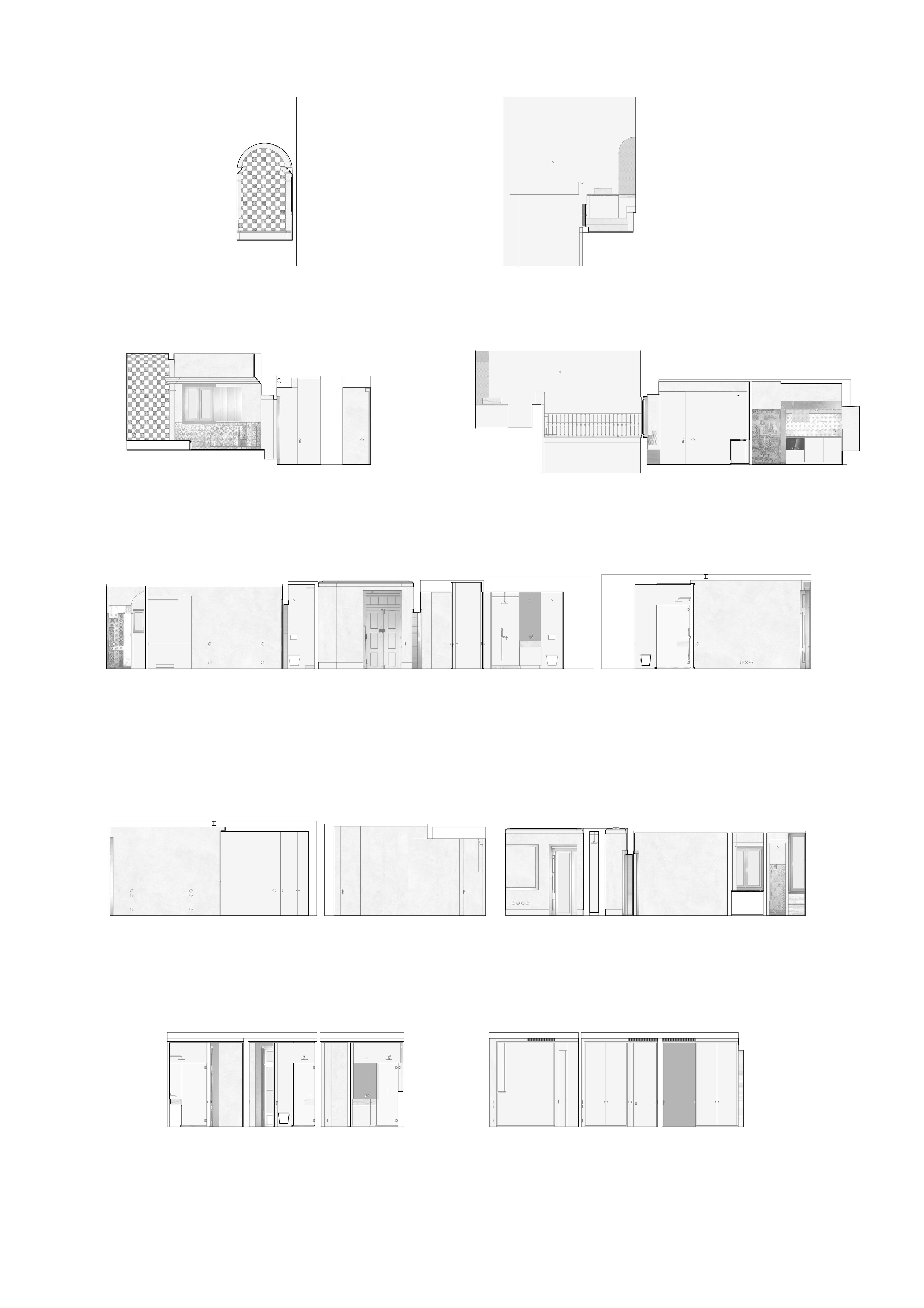
These apartment featured portuguese traditional tiles that were sparsely distributed throughout the house. These tiles were collected, even if broken, and re-used, to refurbish the kitchen that featured big tiled areas but was missing several tiles, and a very small arched space that was to become a bedroom too. The tiles were used to cover a built-in bed space that was inspired by the traditional altairs of portuguese chapels.
